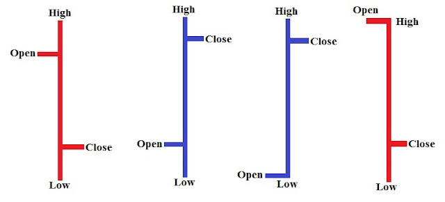
The X-axis on a chart plots the periods for which prices are plotted and the Y-axis plots the value or the price of the share. This could range from a few hours to a few years. This means that prices can be plotted based on the prices that range from hours to years. Thus we could have minute charts as well as hourly, daily, weekly, monthly, quarterly, yearly charts based on the above data.
Short Term Traders trade on the basis of daily charts as they are more interested in the immediate movement in the stock prices, whereas Medium term to Long term Traders are more dependent on weekly / monthly charts as they want more returns for which they are prepared to wait for a longer duration.
There are 3 types of charts which are commonly used by chartists. These are
1. Line charts: The closing prices are plotted on the graph and are joined to form a line.
2. Bar Charts: The Bar uses open / high / low / close for the session.
3. Candlestick Charts: Also use open / high / low / close for the session.
The 4 quotes that are used to construct a Bar Chart or a Candlestick chart are in the order of Open / High / Low / Close
Line Chart
In a Bar chart the open is indicated by a small hash (- ) which is drawn on the left side of the Bar and the close by another hash on the right side of the bar.
BAR CHARTS
CANDLESTICK CHARTS
In a Candlestick chart the real body i.e. the 2 ends of the body, show the opening and the closing price for the given period. The lines at the top and bottom of the real body are called the shadows and they denote the high and the low for that session. The rectangle is called as the real body of the candle and it denotes the open and the close. The colour of the body denotes the open and the close of that session. If the open to close is on the higher side i.e. it is a bullish candle and vice versa if the close is lower than the open it is a bearish candle. Generally the colors used to denote bullish candles are white, green or blue and the bearish candles are red or black.


